Cisco CDR
Choropleth Maps!
August 10th, 2018
If you read our last installment on Maps, you’ll know we can put calls on a map.
There are even more cool maps to display calls on! In addition to Cluster maps, Splunk also has bundled with it Choropleth maps for both Countries and for US States.
A refresher
Before starting, you may want to go review our post on building Cluster Maps. Come on back when you are done there and let’s get our hands dirty.
We assume you can find your data.
So we won’t tell you how to do it beyond Browse > Browse Calls.
Adding Required Fields
- Way over on the right click the green Edit Fields button.

- For users with a lot of international calls, search for and add the fields callingPartyCountry and finalCalledPartyCountry
- Or if your calls are mostly just US, try adding callingPartyState and finalCalledPartyState
- In either case, when you have your fields selected click Save
Change to showing raw data
Let’s now show this in the core Splunk UI to do the custom visualizations we need.
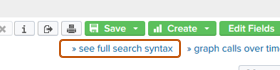
- Click the link to » see full search syntax in the upper right.
- A New Search window will open with a big long search already populated.
Add the magic commands
This is where things go different from the previous article. For one thing, we’re going to go through using “Countries” here, if you are in the US and want to use States it’s this same process only with a slightly different command. We will do US States as a second example below (but read through this one, we’ll use an abbreviated version of it so you need to be familiar with it anyway).
Last time we built a cluster map by adding one command, “geostats”. To build a Choropleth map we need to add two commands, one (stats) to “sum” up the counts by country, another (geom) to tell Splunk how to display that “place”.
- To the end of that search, paste in one of the two below commands, depending if you want the *calling* parties or the *called* parties to display. (Calling is inbound, finalCalled is outbound).
| stats count BY finalCalledPartyCountry | geom geo_countries featureIdField="finalCalledPartyCountry"
 -- OR --
| stats count BY callingPartyCountry | geom geo_countries featureIdField="callingPartyCountry"
- Click the Search button (or just press enter while your cursor is in the search text field).
- Change to the Statistics tab and let’s take a quick look there to confirm.
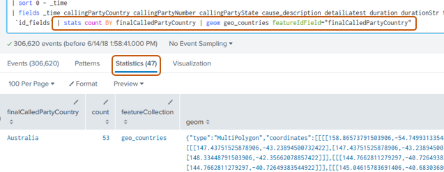
Notice that I added the search from above and that I’m currently looking at the Statistics tab. The stats part is responsible for coming up with the “count” of 53 for Australia. The “geom” command is what came up with that big pile of numbers on the right, which if you squint really hard at is a polygon shaped just like Australia. I promise. You might have to squint *really* hard to see that, or maybe let’s have Splunk show us this!
Make it pretty
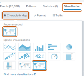
- Change to the Visualization tab.
Splunk *should* pre-select the map type , because we’ve sent the data through the geom command. If so, there’s nothing else you need to do except wait a few moments for the data to populate.
If on the other hand you do not have a Choropleth Map showing,
- Click the Visualization tab, then the Visualization type.
- Change it to Choropleth. This should be under the Recommended section. If not, look farther down.
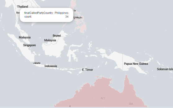
Give that a little while to load…
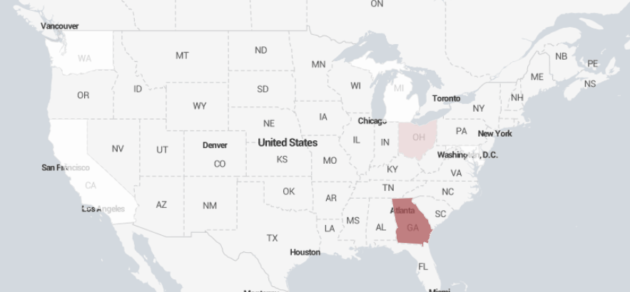
For U.S. States
As promised, here is how to do U.S. States. This relies on the process above, so if you have any questions on how to do a particular thing, refer to the Countries sections above.
- Go to Browse Calls
- Optionally filter/find certain calls.
- Click » see full search syntax
- After getting your New Search window, paste into the end of it
| stats count BY finalCalledPartyState | geom geo_us_states featureIdField="finalCalledPartyState"
 -- OR --
| stats count BY callingPartyState | geom geo_us_states featureIdField="callingPartyState"
- Click the Search button (or just press enter while your cursor is in the search text field).
- Change to the Visualization tab
- Change to the Choropleth map (if it doesn’t automatically load it).
Wrapping up
We hope to have given you the tools to create some nice visualizations using your CDR data. Now maybe those dashboards of incoming calls won’t look so plain!
Related
Great software ultimately has to empower you to achieve more in less time. This extends to the company behind it -- we have to remember to always use your time as efficiently as we can.
And here I am happy to say that we shortened our Product Overview video dramatically. The new one is only 4 minutes long, vs 11 for the old one. You can see it here:
NOTE: the old one showed more of the product and was definitely more complete. In fact this was deliberate because we used it both for new users and also to be a deeper onboarding video for everyday users. However it was a bit too long for anyone who just wanted the short version and didnt want to spend 11 minutes of their day.
February 1st, 2024