Cisco CDR
Quick Wins, #2 – Creating Dashboards
September 22nd, 2020
In our last installment (Quick Wins #1 – High Value information) , we showed a variety of simple to run, high impact reports.
Today, let’s put some of them on a dashboard.
This process has several steps. We are going to
- Put a graph on a brand new dashboard, creating the dashboard in the process.
- Add another graph to that dashboard.
- (This process extends to a third or more, but you’ll get the hang of it with just two.)
- Edit the dashboard to move items around and clean up any formatting you may want.
- Check and change permissions on that dashboard so anyone can see it.
And like the old “Choose your own adventure” books, you can pick one of the following (they’re mutually exclusive, though there’s no reason you can’t build the time picker on a clone of the PDF-sending dashboard…)
- Schedule a PDF of it to be sent each morning,
- Or add a time-picker so you can select timeframes right on the dashboard.
Creating a new dashboard, adding your first graph or chart.
This step starts where the previous blog “Some quick wins, #1” leaves off. I will assume you have a graph you’d like to put on a new dashboard already sitting in front of you.
This set of steps are pretty much the same regardless of where in our app you start.
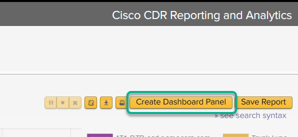
- In the upper right, click the button Create Dashboard Panel

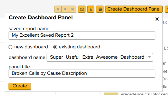
- If you are on a version before 6.1:
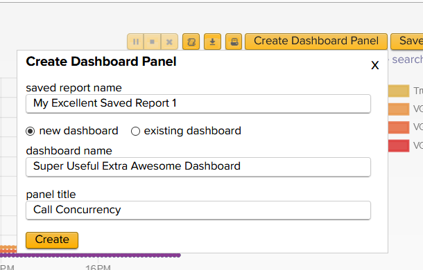
- Fill in a saved report name
- Click the radio button for new dashboard
- Also add in a dashboard name, and optionally a panel title.
When finished you’ll have something like this.
- If you are version 6.1 or newer:
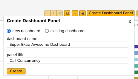
- Click the radio button for new dashboard
- Add in a dashboard name, and optionally a panel title.
When finished you’ll have something like this.
- Click the Create button.
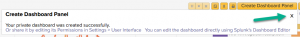
- In the resulting dialog, just click the X.
We’ll use those other options here in a bit, but for now we want to skip right on ahead and add a second graph.
Adding a second graph to that dashboard
Much like the above, I’m going to assume you can navigate to another pretty graph you want to add to this Awesome Dashboard.
- In the upper right, click the button Create Dashboard Panel again
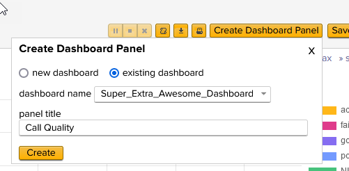
- Click the radio button for existing dashboard
- If you are on a version before 6.1:
- Fill in a saved report name
- Pick the dashboard name from above and optionally add a panel title.
When finished you’ll have something like this.
- Fill in a saved report name
- If you are version 6.1 or newer:
- Pick the dashboard name from above and optionally add a panel title.
When finished you’ll have something like this.
- Pick the dashboard name from above and optionally add a panel title.
- Click the Create button.
- In the resulting dialog, click the link to open the dashboard in the Splunk Dashboard Editor.

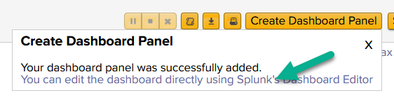
We now leave our app and are using the core Splunk product directly.
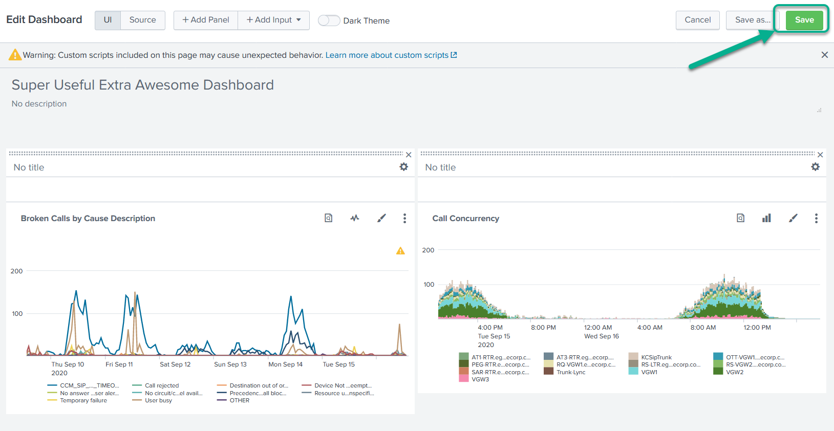
Rearrange the dashboard, also fix formatting
We’ll now rearrange our dash board to suit our needs better, and fix some formatting gaffs while we’re at it.
This section is arranged into a few subsections so you can refer to those parts you need.
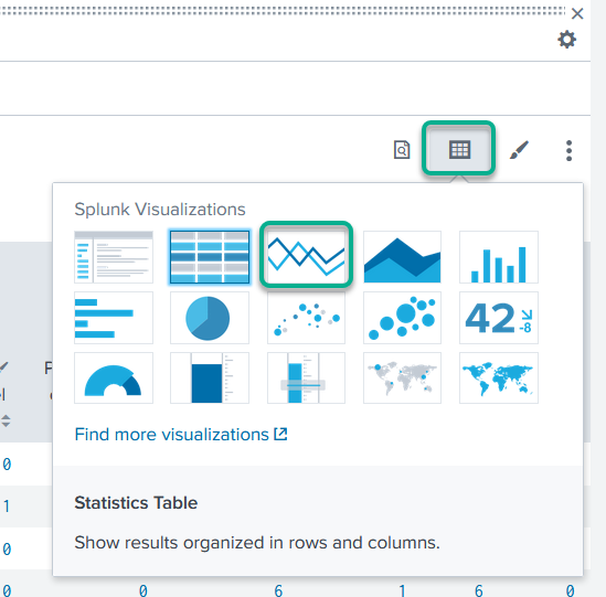
Change to a different visualization
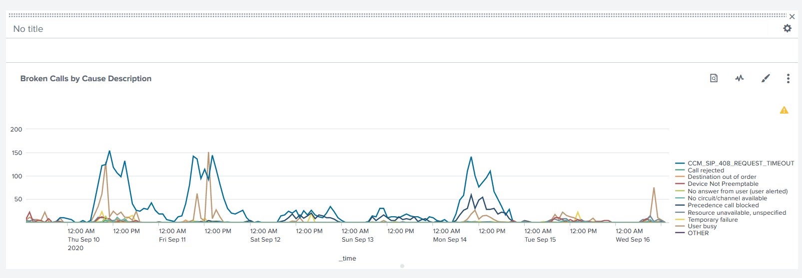
If you have a table like this:
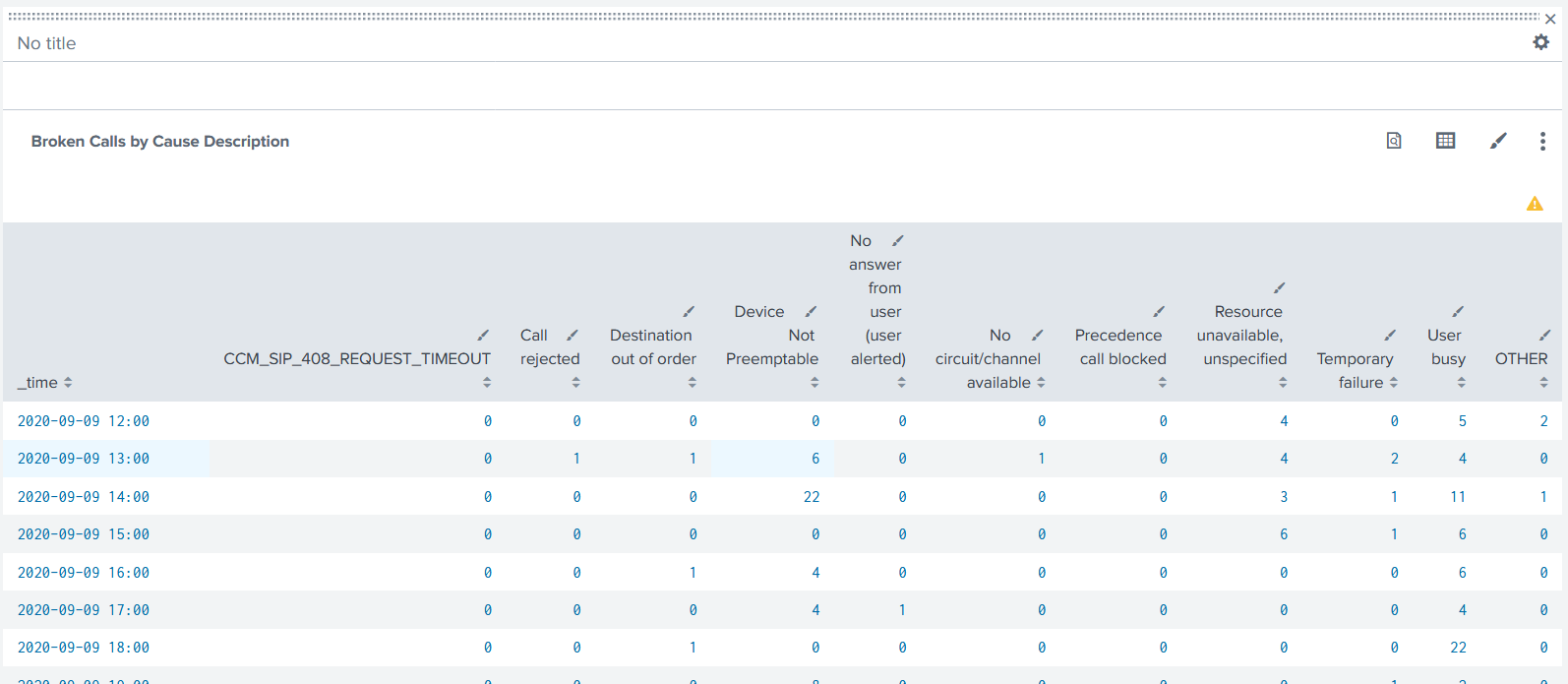
But want this instead:
Click the Select visualization button in the upper right of that table, and select the line chart visualization. (Or column chart – feel free to try a few on for size!)
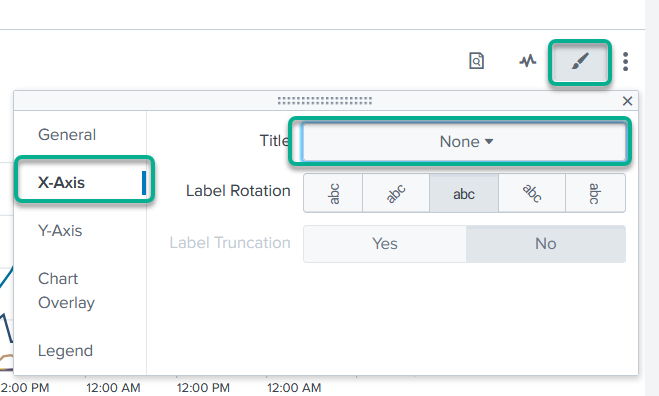
Get rid of the ‘_time’ label at the bottom
If you think this little label ‘_time’ is not necessary:
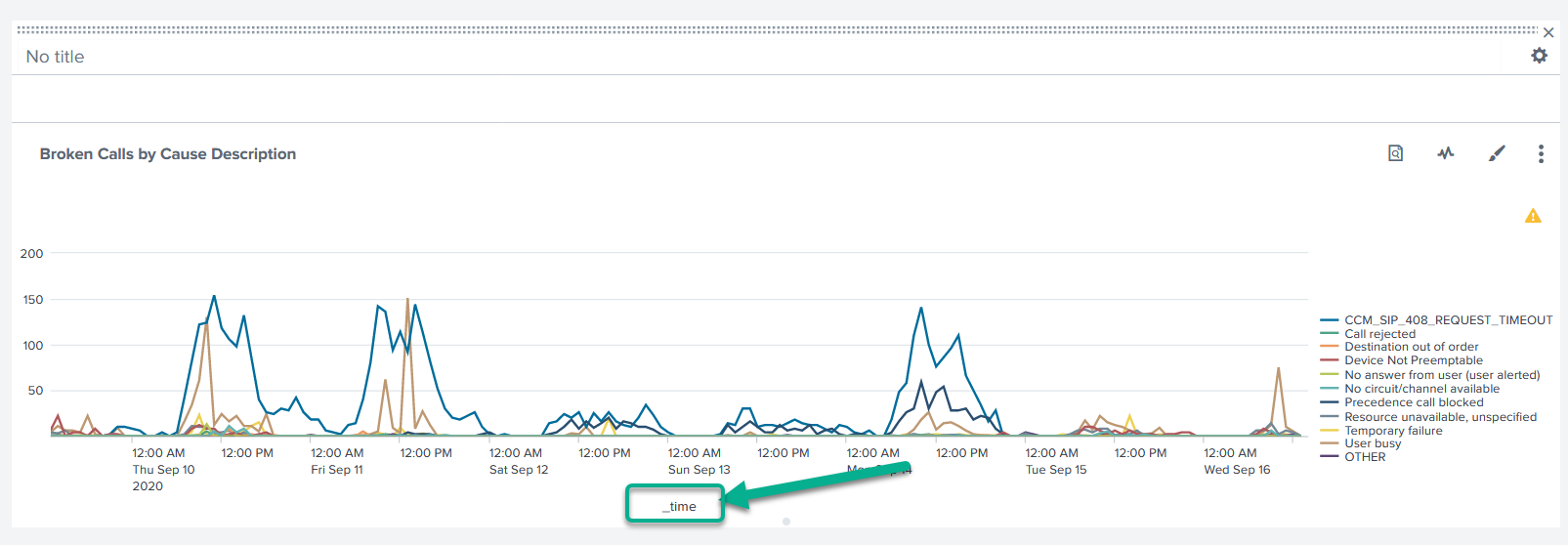
You can remove it from the x‑axis label by clicking the Format visualization button, clicking on the X‑Axis option, then changing the Title to none.
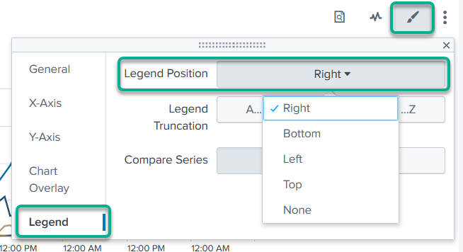
Move the legend to somewhere else
If you’d like to move the legend:
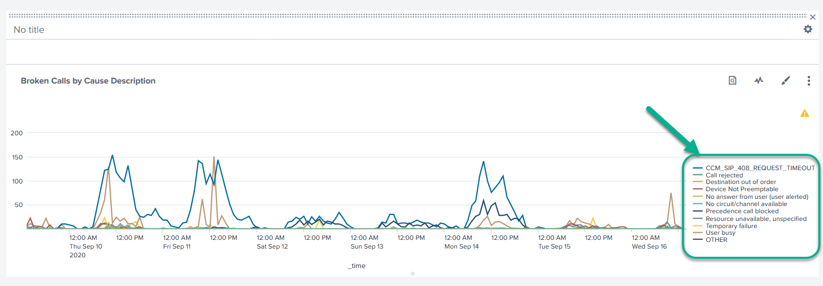
You can do so by clicking the Format visualization button, clicking on the Legend option, then changing the Legend Position to some other option.
Rearrange the graphs
To move the charts and graphs around, just grab the bop of the bar for each (the ::::: part) and drag it into a new position. It’ll try to snap to various locations, so just keep moving it around in the right area until the little ghost shape is in the right place, then let go.

When you have everything where you want it and looking like you think it should, click the big green Save button in the upper right.
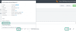
Checking Permissions
By default, Splunk creates new dashboards with permissions only for the owner.
Typically, you’ll want to change this to being shared in “App”, so anyone who has a valid login to Splunk and who can run/open the Cisco CDR app will be able to see your dashboard.
Easily changed!
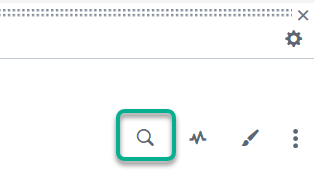
- In the upper right, click the three-dots … settings button.
- Click Edit Permissions
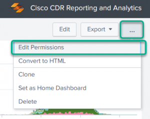
- And all you should have to do is click App in the middle and Save it.
(Usually there’s no need to change the more granular permissions, but if your Splunk folks tell you differently, do what they say)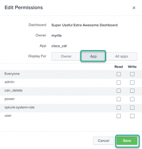

Now everyone who can log into and see the Cisco CDR Reporting and Analytics app can see this dashboard too.
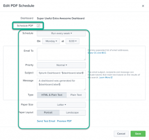
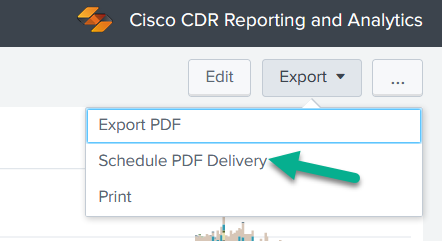
Schedule a PDF to be emailed
Mary needs those charts every day. No one knows why, but since she’s the boss, … fine.
You have enabled and configured email on your server, haven’t you? If you aren’t sure, check your settings against how Splunk says to set it up.
- In the upper right of the dashboard, click Export
- Ignore the first option here, which just generates a PDF that you can save or email manually. Well I mean you can do that if you want, but if you do you are on your own.
- Instead click the second option to Schedule PDF Delivery.

- Then click the little button to Schedule PDF, fill out the details, and … enjoy!

Add a Time picker
Note that this option will remove your ability to schedule PDFs! As a workaround, you can Edit the existing dashboard, and then click Save As to save it as a new dashboard. If it were me, I’d put “interactive” in the name somewhere.
First task, convert all graphs/charts to “inline”
NOT NECESSARY ON VERSION 6.1 AND NEWER. So if you don’t see the option to convert it to inline, don’t worry about it!
This change the charts from being based on the saved report, to being just local Splunk searches.
For each search on the page,
- Click the View report button
- Then click the option to convert it to inline.
- Answer the little warning message.

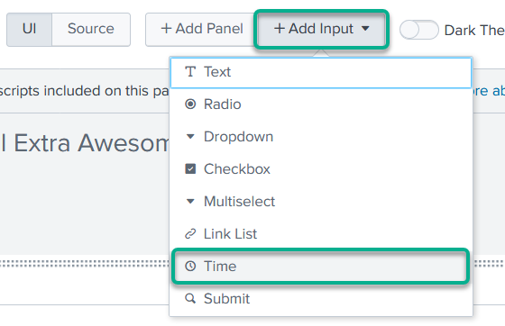
Add a time picker
- Up at the top, click on Add Input
- The click on Time

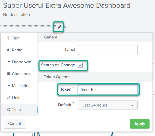
- Click on the pencil/edit button for the new Time input, and
- Check the option to Search on change
- Rename the token to time_tok

- (You can also change some other things, like the default time frame here too.)
- Click Apply
Make that time picker control the times of the charts on the page
Now let’s connect them all together!
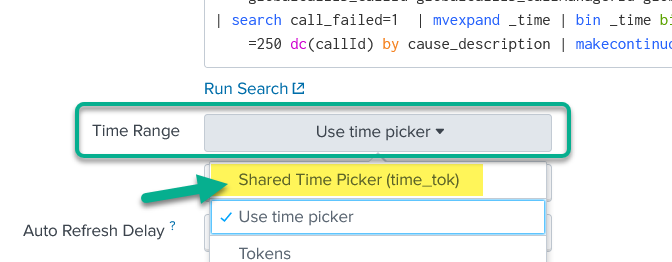
For each chart on the page,
- Click the Edit search button
- In the resulting dialog, change the Time Range to Shared Time Picker (time_tok)

- Save that,
Then Save the entire page.
Now there’s a bug in Splunk and you have to refresh the entire page in your browser. just press F5, or click the little browser refresh button. The page will work properly after though.
Conclusion
These are not the last words we’ll write on this subject, so stay tuned.
In the meantime if you want to play around with more dashboards in the general sense, I suggest starting with the Splunk Search Tutorial. That link dumps you right into the dashboard section – you will probably want to click over onto the start of it and follow it to get the sample data in first, of course.
Related
Great software ultimately has to empower you to achieve more in less time. This extends to the company behind it -- we have to remember to always use your time as efficiently as we can.
And here I am happy to say that we shortened our Product Overview video dramatically. The new one is only 4 minutes long, vs 11 for the old one. You can see it here:
NOTE: the old one showed more of the product and was definitely more complete. In fact this was deliberate because we used it both for new users and also to be a deeper onboarding video for everyday users. However it was a bit too long for anyone who just wanted the short version and didnt want to spend 11 minutes of their day.
February 1st, 2024